PizzaHut.com
Localization
Redefined Pizza Hut’s web localization experience to make selecting the right store and occasion faster, clearer, and more intuitive.
This project marked the first customer-facing release of Pizza Hut’s redesigned web platform — part of a broader modernization effort transitioning from Angular to React and decoupling frontend and backend systems.
I led design for the top-of-funnel experience — including localization, the homepage, and pizza builder — establishing foundational interaction patterns and state-driven flows that shaped future work across the platform.

Why this was complex
Variable store logic and fulfillment rules
Cross-channel alignment (web ↔ app)
Conversion pressure under operational constraints
UX tightly coupled to backend data and operational rules
Launch
August 2020 – pizzahut.com
Platform
Responsive web (Angular -> React rebuild)
Role
Senior UX Designer
Responsibilities
UX, UI design
Prototype & testing
Collaborators
UX Research
Product
Engineering
Tools
Figma, Miro, Jira, Confluence
Problem
Localization is the step where users select their store and occasion (delivery vs carryout). It directly determines menus, pricing, availability, and fulfillment — making accuracy critical to conversion, trust, and franchise operations. However for users, localization was a jarring interruption and a significant drop-off point in the ordering flow.
Customers would unexpectedly land on the localization page after clicking a deal or a menu item. They didn’t understand why they were there, being asked to choose a location before even seeing the menu. It was disorienting and broken — like something hijacked their experience.
Behind the scenes, localization was critical to system logic:
- Each store had unique menus, pricing, and availability
- Menus could vary by occasion
- None of this was clear to users, who wanted to browse and compare prices before committing to an order..
- Additionally, the business needed to encourage carryout during nationwide delivery-driver shortages,
The redesign coincided with a major platform rebuild — migrating from Angular to React and decoupling backend from frontend. To accelerate development and ensure consistency, the team also aimed to align the new web experience with the existing mobile app’s information architecture and interaction patterns.
Goals
Our goal was to make localization feel like a natural, helpful part of the ordering journey — not a disruption or barrier.
We wanted users to understand why they were being asked to choose a store and occasion, guide them quickly through those decisions and back into the shopping funnel – where they wanted to be.
Localization should feel like a natural part of shopping, not a gate in front of it.
To achieve this, we focused on five key objectives:
Clarity
Use simple, friendly language to explain why localization is needed and what comes next — without overwhelming users with system logic.
Conversion
Reduce drop-off by making it easy to start an order from any entry point — homepage, national deal and product pages — and keep users moving forward with confidence.
Cohesion
Ensure the experience felt seamless and intentional no matter how users entered the flow — from inline homepage prompts to deeper entry points.
Carryout encouragement
During a period of nationwide delivery driver shortages, the team also wanted to subtly encourage carryout orders.
Continuity & speed
Align the web flow and information architecture with the mobile app for a consistent experience across channels — and to accelerate development through shared patterns.
Exploration & testing
Initial invitation
I began by reviewing how other QSR brands and international Pizza Hut sites handled localization. In markets like the UK, users had to enter a postcode on a landing page before accessing the rest of the site. We considered this, but found that U.S. users expected to see at least national deals and products first.
Exploring placement and visibility
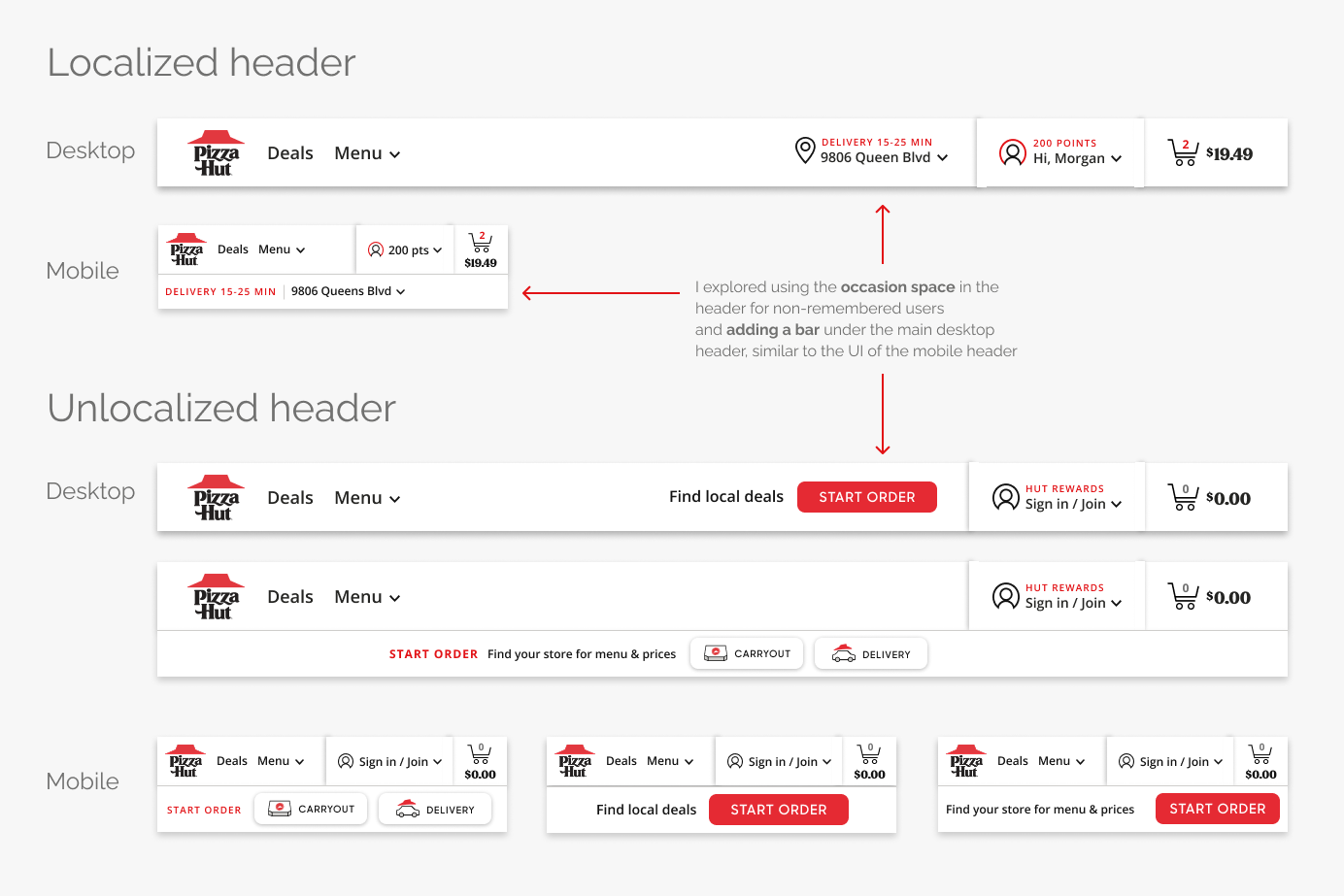
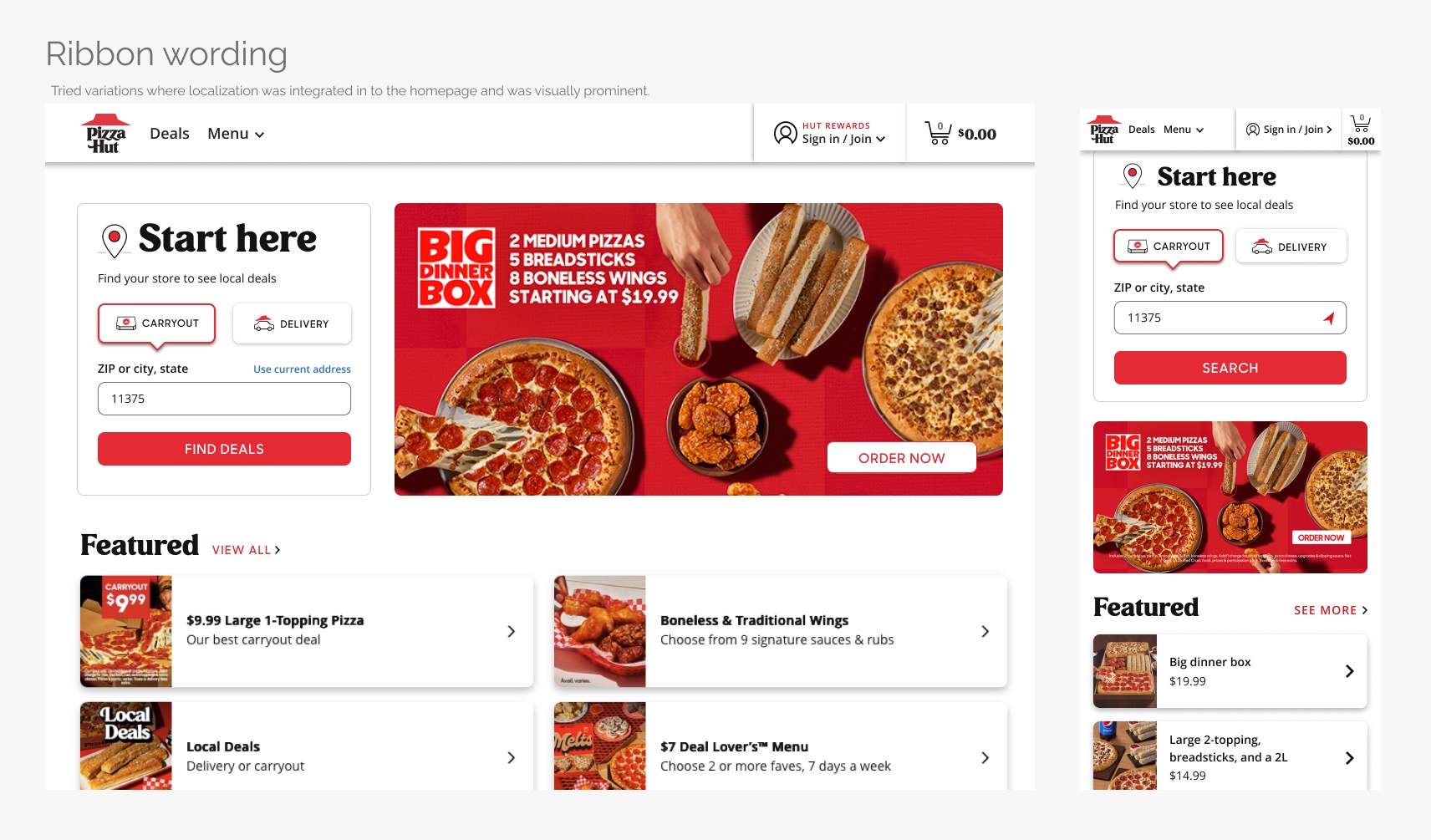
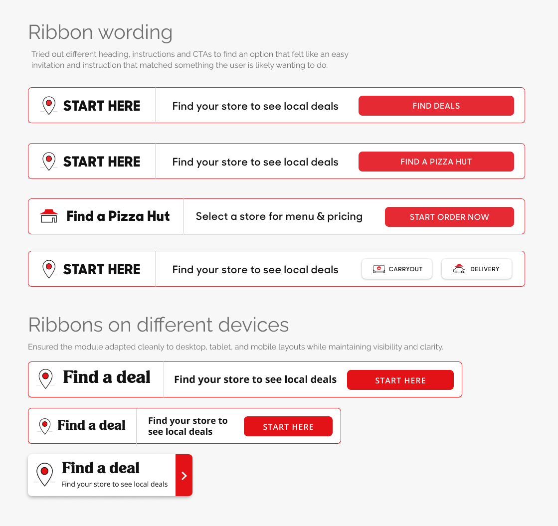
I explored how we could invite users to localize from the homepage — evaluating variations in wording, CTA labels, UI treatments, module placement, and visual hierarchy.
We tested locations across the homepage — in the header, just below it, above or below the hero, and after the deals — to find the right balance between visibility and distraction.
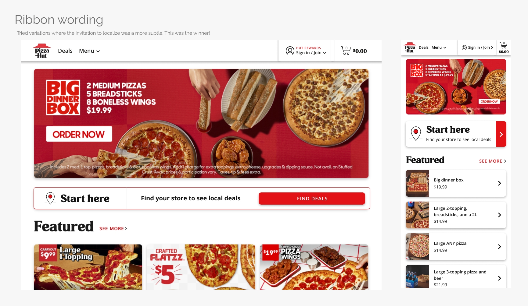
Placement was a key consideration. We tested positions above and below the fold to ensure the module was discoverable without pushing deals too far down the page. Some stakeholders worried this could affect conversions, which we later validated through data.
My goal was to balance discoverability with conversion risk — making localization visible without interrupting deal browsing.
The winning direction: localization ribbon
After several iterations, the ”localization ribbon” emerged as the strongest direction — a lightweight, visible prompt for non-remembered users to start their order without interrupting their browsing.
Remembered users saw their previous store and occasion in the redesigned header. When these users began a new order, a confirmation modal appeared to verify their details — preventing errors like accidentally sending a pizza to Grandma’s house.
Inside the Rail: Designing the Localization Flow

Because the existing flow redirected users to a new, unexpected page, it felt jarring and disorienting. To reduce that friction, I introduced a right-hand slide-out rail — keeping users anchored in context while creating a reusable, responsive pattern across devices.
The new rail also made it easier to reuse mobile app patterns across devices — aligning data structures, layouts, and hierarchy for consistency and faster development.
Lightweight data entry
Within the rail, I explored ways to make data entry as lightweight as possible — testing different patterns for occasion selection (carryout or delivery) and identifying the minimum information needed to return relevant results. This reduced cognitive load and perceived effort while keeping focus on the user’s main goal: getting back to browsing or ordering quickly.
The data entry experience adapted to the user’s status:
- Signed-in users could instantly choose from saved addresses in a dropdown or enter a new one.
- Mobile guests could tap the location (compass) icon to detect their current location via geolocation.


Map and store selection
While delivery users were matched to a single store, carryout users often had multiple options — especially in dense markets like Dallas. To help them choose, the experience paired a map view with the list of store cards. Because search results were based on the geographic center of the ZIP or city entered, the first store listed wasn’t always the closest. Tapping a pin on the map automatically selected the corresponding store card and moved it to the top of the list, creating a clear, responsive connection between map and list.
Refining store cards
While I needed to match the app’s structure, I was still able to refine the store cards to balance detail and clarity — experimenting with how much information to reveal at each state. Selected cards displayed all relevant details, while unselected cards were simplified for quick comparison. When stakeholders requested more visibility into hours and store info, I added a collapse/expand interaction that surfaced key details by default and kept extra data accessible on demand.
Dynamic store states
Because store availability is highly dynamic, I designed for operational edge cases such as closing soon, delivery temporarily unavailable, or weather-related closures. In each case, users were given clear alternatives — like switching to carryout or pre-ordering for later — keeping them in control and avoiding dead ends.

Iteration & testing
We developed interactive prototypes to test both the homepage ribbon and the flows within the rail — including occasion selection, field entry, and store cards — across mobile and desktop layouts.
Early feedback confirmed that keeping users on the same page felt far less jarring than redirecting to a separate localization page. The slide-out rail reduced disorientation and perceived effort, creating a smoother transition back into the shopping flow.
To build confidence, I also explored headings and support copy that explained why users were seeing this step and how it benefited them — giving context that this was to show accurate menus, prices, and local deals.
Through internal reviews, user testing, and A/B experiments, I refined wording, hierarchy, and placement to improve comprehension and conversion. Each iteration made localization faster, clearer, and more connected to what users wanted to do next.
Design system foundations
As part of the redesign, I also began laying the groundwork for a unified design system. I conducted a comprehensive audit of the existing visual patterns and inconsistencies, defined a new typography scale for desktop and mobile, and refined color palettes to meet WCAG 2.1 contrast requirements.
In addition, I designed early component patterns such as cards, badges, buttons — creating a visual language that balanced Pizza Hut’s bold brand personality with enterprise-grade usability. These foundations later evolved into the scalable design system that supported future features across thousands of stores and multiple digital channels.
Outcome & impact
The redesigned localization experience launched in August 2020 as the first customer-facing release of Pizza Hut’s new platform. Although the new experience was initially accessible only from the homepage, early metrics showed clear improvement in engagement and conversion:
Bounce rate decreased across all screen sizes, indicating that the new experience successfully encouraged interaction and exploration rather than abandonment.
+0.28pp
Overall site conversion
+11.3pp
Localization completion rate
+0.28pp
Top-of-funnel conversion
Confirming homepage localization flow is bringing more users into the order funnel
+0.8pp
Carryout selection
Aligning with business goals during the nationwide delivery-driver shortage
While localization conversion for users already in the funnel decreased slightly (–0.6 pp), this was expected — surfacing localization earlier captured lower-intent browsers. The overall gains in engagement and conversion validated the new approach.
Once the rest of the site migrated to the new platform, adoption was expected to rise further — extending the improved experience beyond the homepage and compounding its impact on conversion.
The new design demonstrated that a small, contextual interaction could meaningfully reduce friction, increase engagement, and shift customer behavior toward faster, more profitable order types.

Localization ribbon and rail, with some updates, can also be seen on PizzaHut.com.