Pizza Hut
Call center POS
Led an end-to-end redesign of two legacy POS systems into a unified, web-based platform for Pizza Hut’s call centers — modernizing a mission-critical operational tool where speed, accuracy, and trust matter every second.
Why this was complex
Multiple user roles with competing needs
Two legacy systems with embedded assumptions
High cost of error (speed, accuracy, trust)
Ongoing training and turnover constraints
The need to align call-center workflows with broader restaurant and digital ecosystems
Role
Senior UX Designer II
Responsibilities
Led design strategy across UX, UI, and system patterns
Partnered closely on research, testing, and validation
Defined end-to-end workflows and complex edge cases for the call-center ordering experience
Managed and mentored a junior designer
Oversaw design delivery and timelines
Collaborators
UX Research, Product, Engineering, Operations, Data

Discover
Understanding the call center reality
The operational landscape
Pizza Hut’s call centers were operating on two separate, decades-old POS systems with outdated interfaces and limited flexibility. While credit is due to the engineering teams who kept them running for so long, the tools struggled to support evolving business goals and modern user needs.
In an environment with constant staff turnover, these systems were especially difficult to learn. Supervisors spent a disproportionate amount of time helping new employees navigate the tools instead of focusing on customer experience and performance.
The business needed more than a redesign — it needed a platform that could evolve with the brand, supporting new menu items, features, and operational changes without major technical overhauls.
But behind every system constraint were real people trying to do their jobs — often relying on memory, workarounds, and each other to get through a shift.

A systems-level challenge
Drawing on my experience with Pizza Hut’s e-commerce and in-store platforms, I entered this project knowing the call center experience would be deeply shaped by the systems behind it.
Agents depended on accurate menu data, store availability, pricing rules, and localization logic flowing across multiple platforms. Inconsistencies between call-center tools, in-store POS, and customer-facing systems created gaps in trust, speed, and accuracy.
I worked closely with product, engineering, and data partners to map how information moved between systems — identifying gaps in menu data, store configuration, and order handoff between the call center and legacy in-store POS. This work helped define where parity was required immediately and where we needed to design for future alignment.
Planning beyond the call center
While the initial rollout focused on call centers, the long-term vision was bigger: this POS was being designed as the foundation for a future, unified platform across call centers and restaurants.
That meant not only achieving parity with existing tools, but also anticipating in-store needs such as additional occasions, driver dispatch, product outages, and back-of-house workflows. From the beginning, we considered constrained terminal environments — including 1024×768 screens and touchscreen interactions — so the system could scale beyond its first use case without sacrificing accessibility or usability.
Observation & field research
I partnered closely with UX Research and Product to understand the real call center experience. Together, we conducted on-site observations and interviews across multiple locations, working with new and experienced agents, supervisors, and managers.
We saw how deeply users relied on memorization, workarounds, and peer support to overcome system limitations — signals that the tools, not the people, were creating unnecessary friction.
In parallel, I conducted heuristic evaluations of both legacy systems (TMS and Panda) and reviewed POS tools used by other QSRs such as KFC, Taco Bell, McDonald’s, and Chick-fil-A to identify industry patterns and opportunities.
Synthesizing the data
I facilitated an affinity-mapping session with the UX team to organize findings from field research, interviews, and product insights into clear patterns. We grouped observations into clusters of related themes, refining them to surface the most meaningful insights.
Those insights became the foundation for our design principles.

Define
Turning insights into direction
Making sense of what we learned
Through synthesis, it became clear that the challenge wasn’t simply modernizing outdated tools — it was redefining how the call center connected to in-store teams, digital platforms, and the systems that power menu, pricing, and fulfillment.
The legacy POS operated largely in isolation, relying on its own mapping, menu data, and product assets — all maintained separately from customer-facing and in-store systems. That separation created extra overhead and made it harder to keep information current across channels.
Agents were also juggling multiple tools, workarounds, and memorized steps in an environment where speed and accuracy mattered every second.
By designing the new experience to pull from the same data sources as PizzaHut.com — including product details and imagery — we reduced duplication, improved consistency, and created a stronger foundation for a unified experience across call centers, restaurants, and digital platforms.
User types
We identified 3 user types we needed design for – call center agents and supervisors and in-store team members. The long-term plan was to create call center first and then modify as needed to use in-store as well, so all orders were going thru one consistent tool.

Call center agent
High-volume order takers who need clarity, speed and confidence in every interaction.
Core needs
- Fast, intuitive order taking
- Easy access to product and pricing details
- Faster ways to do common tasks
- Visibility of all active orders regardless of what channel it came through
Key frustrations
- Multiple sources for reference info
- Steep learning curve
- Cognitive overload, especially during peak time

Call center supervisor
Responsible for training, quality, and performance — often carrying the burden of system complexity on top of people leadership.
Core needs
- Easier onboarding for new agents
- Clear performance visibility
- Tools to support coaching and quality
Key frustrations
- Spending too much time troubleshooting tools instead of coaching people
- High training overhead due to complex systems and constant turnover
- Limited visibility into performance and call quality in tool

In-store team
While the initial rollout focused on call centers, in-store teams played two critical roles in this experience: they were the long-term audience for the platform and the immediate recipients of orders created in the call center. That meant the system had to support both how stores work today and how they would work tomorrow.
Core needs
- Clear, accurate orders that translate cleanly into the legacy in-store POS
- Simple, flexible order entry for busy, noisy environments
- Interfaces designed for shared terminals and touchscreen use, with future expansion to mobile in mind
Key frustrations
- Steep learning curves and complex workflows in existing tools
- Orders arriving with missing context or unclear modifications
- Workflow interruptions when systems didn’t sync cleanly across call center and store
- Juggling fulfillment while handling multiple tools and touch-points
What this meant for design
Designing for in-store teams required thinking beyond the call center interface. I had to ensure that decisions made upstream — terminology, constraints, pricing logic, and order structure — would hold up in downstream systems and real restaurant environments.
This dual lens shaped everything from how items were described in the cart to how changes and exceptions were handled across platforms.
Design principles that guided the work
During synthesis, we organized our research insights into key themes and connected them back to Pizza Hut’s broader brand principles. This ensured our design direction not only addressed user needs but also reflected the brand’s commitment to consistency, hospitality, and speed across every customer and employee touchpoint.
Guidance & clarity
Food first, Build trust
Design the experience so agents always know what to do next, what to say next and what matters most in the moment.
In practice, this meant:
- Integrating product details and pricing so it’s easy to review (not in outside resources or from memory)
- Using clear terms and guiding language that matched how people actually talk
- Designing workflows that naturally guided agents from one step to the next — reducing hesitation and guesswork
Efficiency & accuracy
Modernize hospitality, Simplify
Remove friction so agents can move quickly without sacrificing confidence.
In practice, this meant:
- Eliminating unnecessary interruptions and modal overload
- Showing the right amount of detail at the right time — enough to support accuracy, not so much that it slows agents down
- Making pricing transparent throughout the experience, not just at checkout
Intuitive order taking
Modernize hospitality, Food first
Design for how customers think about ordering — not how systems store data.
In practice, this meant:
- Aligning flows to natural conversation patterns
- Making products and deals easier to find
- Supporting flexible actions like one-click adds, so agents could keep pace with the conversation instead of being forced through rigid screen sequences
Inclusion & integration
Modernize hospitality, Celebrate
Create an experience that works for different roles, abilities, and environments — and connects seamlessly across systems.
In practice, this meant:
- Designing for call center agents, supervisors, and in-store teams with different needs
- Ensuring data flowed cleanly across call center tools, in-store POS, and customer-facing systems
- Supporting more personalized, consistent experiences for customers — no matter how they ordered (app, web, store, call center)
Modern & Clean UI
Simplify, Celebrate
Use visual clarity to reduce cognitive load and build confidence
In practice, this meant:
- Designing dashboards that surface key metrics and wins at a glance
- Establishing a clean, accessible visual system that supported long sessions and fast scanning
- Creating a responsive foundation that could scale across screen sizes, shared terminals, and touch interactions
Defining success
To meet that challenge, we aligned on three core goals:
Unify the experience
Move all call centers onto a single, web-based POS.
Reduce friction
Create a modern, intuitive tool that let’s agents focus on the conversation and training focus on products.
Strengthen operational connection
Make the call center an extension of the in-store team through two-way visibility and order management
Old POS – A disjointed user journey
System-driven flow that interrupts conversations.

New POS – A guided user journey
Conversation-first flow that guides without getting in the way.

Design principles in action
These examples show how our design principles translated into real, day-to-day decisions — shaping everything from information hierarchy to cross-system workflows.

Design
Reimagining the flow of conversation and ordering
With a clear picture of our users and the systems they worked within, I focused the design on one guiding belief. It shaped every major decision, from how agents localized an order to how they built a pizza to how the platform integrated with the broader Pizza Hut ecosystem.
Guiding belief: The system should adapt to the conversation — not the other way around.

Exploring early concepts
Before moving into detailed design, I explored multiple interaction models to simplify order taking and reduce cognitive load. These early concepts weren’t just about visuals — they helped the team align on:
- How guided the experience should feel
- Where speed mattered most
- What belonged in MVP vs. future phases
Sharing these explorations early allowed product, engineering, and operations to react to direction, not just deliverables — helping us confirm priorities and move forward with confidence.
Testing early and often
We prototyped quickly and tested with call center agents and supervisors, using each round to pressure-test real call scenarios. These sessions helped us:
- Validate critical flows like localization and pizza building
- Confirm what belonged in MVP vs. post-launch
- Catch friction early — before it became technical debt
Those learnings didn’t just refine the experience — they shaped how we prioritized the roadmap and structured future enhancements. I partnered closely with product to translate testing insights into clear MVP priorities — helping define what needed to ship immediately to support agents in live calls, and what could move into phased releases without compromising the experience.


Styles and components
As the design matured, I formalized the visual language and component patterns to support a complex, high-volume workflow. We established reusable components, accessibility standards, and clear hierarchy — balancing Pizza Hut’s brand personality with the demands of an enterprise tool.
This system made the experience more consistent for agents and faster to build for engineering — setting a foundation that could scale beyond the initial launch.
Integration over isolation
The challenge
The legacy POS maintained its own product images and visual assets — separate from both the website and the in-store systems. Each surface required its own updates, creating duplication, outdated content, and unnecessary work for design and content teams.
The call center redesign became an opportunity to break that pattern — serving as the first step toward integrating the POS experience and reducing long-term fragmentation across channels.
The decision
I didn’t want to treat the new call center experience as another one-off surface, so designed it as part of a shared ecosystem. I integrated the POS with the same image sources used by PizzaHut.com, using flexible components and CSS to adapt presentation where needed — instead of creating and maintaining a parallel asset system.
What this enabled:
- Dashboard product features stayed aligned with current promotions
- Product tiles and toppings reflected the same visuals customers saw
- Fewer manual updates and less content drift
- Faster future changes when brand or merchandising evolved
Why it mattered
This reduced long-term maintenance, prevented experience fragmentation — while also laying the groundwork for future POS integration across call centers and restaurants.
Chaos to clarity: Localization

Why localization matters
Before an agent can take an order, the system has to answer a few critical questions first: Who are you? Which store? Which occasion — delivery or carryout?
Those choices determine:
- Whether the customer is new or returning
- What menu loads
- What pricing applies
- What availability exists
- Whether the order reaches the right store with the right details for fulfillment
To customers, this step often feels jarring — they are ready to say “I want a large pepperoni.” But behind the scenes, localization is essential to make the rest of the experience work.
That tension — between what the system needs and what the conversation wants — made localization a critical moment we had to get right.
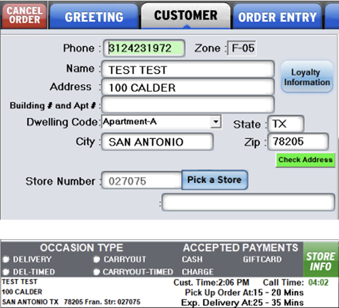
Two disconnected screens with overlapping responsibilities.
Agents must know which screen(s) and fields they should use. And they could accidentally skip the customer screen altogether.
Required actions buried among unrelated or outdated fields.
To find a carryout store the agent must click "Pick a store" button to open "Store finder" screen. Field connected the button is disabled causing confusion. And any location information entered in fields above will be ignored by the "Store finder" screen.
Fields change meaning based on context without clear guidance
Depending on dwelling type selected the name, address and delivery instruction field labels and meaning change. Sometimes the labels disappear altogether. In addition, there are not character constraints to match how the in-store POS will consume this data.
Occasion details are noisy and unclear
Even though this occaion panel is persistent and noisy, while competing with everything else vying for attention on the screen. So, this critical selection can be missed, only to fail later. The terms are unclear. Ex: no one understood "DEL-TIMED" meant schedule order for later.
The challenge
In the legacy POS, localization was one of the most confusing and error-prone parts of the experience.
Agents had to navigate:
- Two disconnected screens with overlapping responsibilities
- Required actions buried among unrelated or outdated fields
- Fields that changed meaning based on context without clear guidance
- Critical selections that could be missed — only to fail later
Unclear terminology (e.g., “DEL TIMED”)
A persistent, noisy information panel competing for attention
Everything demanded focus at once — and success depended on tribal knowledge, not the interface.
The insight
Localization is a necessary interruption to the customer conversation. So, the interface should do everything possible to make that interruption short, clear, and confidence-building.
Instead of overwhelming agents with every possible detail up front, I focused on progressive guidance — asking only what mattered right now, and revealing the rest when it became relevant.
Designing for real call states
Localization also had to adapt to very different call contexts — not every agent was starting from the same place.
Some agencies had screenpop, a script that automatically pulled in the customer’s phone number and the store they called. In those cases, agents could begin a call already localized — sometimes even seeing an existing customer or an active order before saying hello.
Other agencies must enter everything manually.
Instead of forcing every scenario through the same flow, I designed the Start Order experience to respond to these states:
- New vs. existing customers
Showing known information when available (such as previous delivery addresses for quick selection), while keeping the experience simple for first-time callers. - Active orders
Surfacing context when a customer was calling about something already in progress — without interrupting new orders. - Screenpop vs. manual entry
Defaulting intelligently when data was available, and guiding clearly when it wasn’t.
This ensured the experience felt helpful, not presumptive — and allowed agents to stay present in the conversation instead of translating system complexity in real time.

The design move
I restructured localization around three principles:
Guide first, don’t overwhelm
- Start with only the essential questions
- Show a simple greeting script that adapted to the call state
- Show clear defaults (carryout occasion selected by default, store auto-selected when possible)
- Let agents get oriented before introducing complexity
Filter everything by context
- Fields, previous addresses, and store options respond to the selected occasion
- Delivery shows only what delivery needs
- Carryout shows only what carryout needs
- No more guessing what fields to fill in and which to skip
Surface confidence, not clutter
- Clear promise times for both carryout and delivery
- A clean confirmation moment: You’re localized. You’re ready.
- A single, unmistakable CTA: Continue to menu
Protecting the conversation
I also audited everything that competed for attention in the early moments of a call — and deliberately moved anything that wasn’t essential to getting the conversation started.
These weren’t removed — they were re-timed:
- Contactless preferences → moved to Confirm & Pay
- Loyalty entry → moved to Confirm & Pay
- Reorder → moved to the Main Menu, where it could support the flow instead of interrupting it
The goal was to keep the beginning of the experience focused on connection and clarity, and move transactional details to the moments when they naturally belonged.
I treated the early moments of the call as sacred — stripping away anything that interrupted the conversation, and intentionally relocating features like loyalty, contactless, and reordering to the moments when they could support the experience instead of competing with it.
Listening and iterating
Once agents moved into the take order portion of the flow, they see the selections they made on the Start Order screen reflected in the header – customer’s first name, occasion and the related street address. I initially had simple Edit link next it that would return the user to the Start Order screen. In testing, agents told us something better: “I might not want to leave to change localization. I want to see details without having to leave where I am in the order.”
After getting their input on the most helpful information to surface in this moment, I redesigned it as a dropdown that displayed:
- Full address
- Promise times
- Today’s hours
- Payment options
- Plus a clear Change action
This shift protected the flow of the conversation, allowing agents to answer quick questions without breaking their momentum:
“Do you take Amex?” “Did I remember to give you my gate code?” “What’s the wait for delivery, maybe we’ll pick it up instead?”
This change allows the agent to keep up with the conversation, easily responding to questions without losing their place in the current task — “Oh do you take Amex? Did I remember to give you my gate code? What’s the wait for delivery, maybe we’ll pick it up instead?”
When we brought this back in the next round of testing, agents immediately recognized their feedback in the design — and felt heard.

The system win
Behind the scenes, this experience was powered by the same data sources used by PizzaHut.com — including store details, hours, and payment methods including images. That meant no duplicate content workflows, no outdated visuals, and no parallel systems to maintain.
Why this mattered
This redesign turned localization from a stressful checkpoint into a guided transition — helping agents move confidently from “Who is this?” to “What can I get you?” without breaking the flow of the conversation.
It reduced cognitive load for new agents, prevented downstream errors for stores, and made the experience feel intentional instead of improvised.
Ordering, not shopping
The challenge
Customer-facing menus are built for browsing and deciding. Call center agents are built for listening, translating, and acting fast. In the legacy tools:
- Agents had to complete rigid flows to see pricing
- Simple orders took too many steps
- Pricing, product details, and modifiers lived behind extra steps or in external sources, making common questions hard to answer in real time
This slowed the conversation and increased the chance of error.
The insight
For agents, speed and clarity matter more than visual delight. So instead of copying the website experience, I designed the menu and pizza builder specifically for verbal ordering:
- “Large pepperoni.”
- “Medium pan supreme.”
- “No pork. Add mushrooms.”
The interface needed to keep up with that rhythm.
The design moves
Speaking the agent’s language
I listened to real ordering calls and observed how customer’s described the pizza they wanted and how agents read orders back to confirm accuracy.
What I noticed:
- Agents didn’t rely on dense ingredient lists
- Customers would get lost in long descriptions filled with details they never mentioned
- Both looked for short, conversational summaries they could quickly speak and easily confirm
Because the default data mirrored the customer website — listing every ingredient, sauce, and amount — I recommended reshaping the summary model to match how people naturally describe food.
“Large Meat Lovers, no pork, add mushrooms” — not
“Large Meat Lovers with classic sauce, cheese, ingredient 1, 2, 3…”
We then tested this approach with agents to confirm it improved read-backs and customer confirmation before investing in additional development.
This made read-backs faster, confirmations easier, and reduced misunderstandings during live calls.
That same pattern carried through the cart and checkout, creating a consistent, conversation-friendly summary across the entire flow.

Building with clarity, not clutter
When customization was needed, the pizza builder became a focused workspace:
- Clear, scannable selectors for crust, size, toppings, sauce, and cheese
- Smart constraints (e.g., stuffed crust only for large) surfaced in context
- Allergen and calorie info available in info rails — helpful, not distracting
We explored many layouts, but every decision came back to one question: Does this help an agent move faster and more confidently?


One-click where it counts
The pizza menu was designed for fast adds:
- Default size and crust set to the most common choice
- Popular recipe pizzas could be added in a single click
- Customization only when it was actually needed
This lets agents add items as quickly as customers spoke — without forcing them into a builder for every order.
We also surfaced an explicit “Create your own” entry point to intentionally route agents into the builder when true customization was needed.

Progressive disclosure over overload
We deliberately avoided surfacing everything at once:
- Half/half and extra options appear when relevant
- Special instructions streamlined into common one-click actions
- Complex details available, but never in the way
Unlike a customer browsing online, agents don’t need to be taught what’s possible — they already know the options. That gave us permission to hide advanced customizations until they were actually relevant, keeping the interface focused on the conversation instead of the controls.
This kept the experience clean for the vast majority of orders — without limiting the edge cases.

Pricing transparency baked in
In the new experience:
- Prices update directly in product tiles
- Upcharges appear at the point of selection
- A clear summary box shows exactly how the total is built
Not just for accuracy — but so agents could confidently answer the most common question on the phone:
“Why is this pizza so much?”
The system reality behind the scenes
The menu and builder also had to perform under real-world constraints:
- Menus vary by store
- Images needed to load fast
- Builders are heavy experiences
So we made intentional tradeoffs:
- A separate pizza menu page for speed
- The builder in a full-screen overlay to give complex tasks the space they needed
- No unnecessary dynamic visuals that would slow performance or inflate scope
The result: An experience that was faster for agents — and more sustainable for the platform.
Why this mattered
This work wasn’t about making the pizza builder prettier. It was about making order taking easier, faster, and more human — so agents could stay focused on the customer instead of fighting the interface.
End-to-end

An end-to-end prototype demonstrating how agents move from dashboard to completed order in a single, coherent flow.
To respect client confidentiality, I’m only able to share a portion of this work publicly.
For hiring managers and collaborators who’d like a deeper look, I provide access to the full end-to-end prototype and additional design details upon request.
Please request the password to the end-to-end prototype and more design details.
Delivery, impact & learnings
Delivery & implementation
I partnered closely with product and engineering to bring the new call center POS to life — defining MVP scope, sequencing features based on user impact, and supporting handoff with detailed flows, components, and accessibility guidance.
User impact
While full quantitative metrics weren’t available, qualitative feedback from agents and supervisors consistently reinforced that the new experience reduced friction, improved confidence, and made it easier to stay focused on the customer instead of the tool.
Across usability sessions and design reviews, agents responded positively to:
- A clearer, more guided localization flow
- Reduced cognitive load at the start of calls
- Better pricing transparency
- Faster paths for common actions
One of the most telling moments came up again and again in testing: “How soon can we have this?”
Business & platform impact
The redesigned system:
- Reduced reliance on memorization and workarounds
- Improved pricing transparency and error prevention
- Laid the foundation for long-term platform consolidation across call centers and stores
By aligning the POS with shared data sources and design systems, the work also reduced duplication and positioned the platform for faster evolution as the business changed.
What I learned
Designing for operations is different than designing for customers
Tools built for internal teams require a different kind of empathy — one that prioritizes speed, accuracy, and cognitive load over visual delight. The most impactful designs weren’t the prettiest screens, but the ones that quietly removed friction from high-pressure moments.
System thinking changes the quality of design decisions
Treating the call center as part of a broader ecosystem — not a standalone surface — led to better long-term outcomes: fewer workarounds, less duplication, and designs that could scale beyond the first release.
Iteration builds trust, not just better UX
Some of the most meaningful improvements came from small moments of listening — like rethinking how localization details appeared in the order flow. When users saw their feedback reflected in the product, it didn’t just improve usability — it built confidence in the design process.
Clarity beats completeness
In complex systems, the instinct is often to show everything. This project reinforced that the best experiences come from restraint — carefully deciding what not to show yet, and letting the interface reveal complexity only when it’s needed.
Closing reflection
This project reinforced why I love working on complex, operational tools. The impact isn’t always flashy — but when you make it easier for someone to do their job with confidence, clarity, and less stress, the ripple effects are real. This work wasn’t just about redesigning a POS — it was about reshaping how the call center fit into a larger system, and making that system work better for the people inside it.